Client: NOWON USA
Year: 2019 - Present
Art Direction & Design: Meijun Li
Illustrations: Meijun Li, Jane Zhang
Photos Credits: Meijun Li, @youngskeletons

By American-Korean Chef Jae Lee, NOWON takes its name from his hometown, Nowon-gu in Seoul. With its first location in Manhattan’s East Village, a second in Bushwick, and its latest outpost in Boston’s Seaport, NOWON brings the bold, expressive flavors of Seoul into a lively, neighborhood-centered setting. The concept marries the energy of Korean nightlife with New York’s creative edge, celebrating food, drink, and cultural connection in a playful, immersive atmosphere.

The logo features this night life scenario with three tigers drinking together at a Pojangmacha. Pojangmacha is a small tented spot that can be on wheels or a street stall in South Korea that sell a variety of popular street foods and serve alcoholic beverages such as soju, the tables are usually silver metal, either in round or perfectly square shape.
In Korean culture, the act of holding soju shot glasses with two hands, making eye contact, and showing respect is deeply meaningful. It's akin to graffiti art with meticulously crafted details. Our goal is to design a logo that beckons passersby to join us for a drink and a good time. The logo will feature a perfectly mirrored reflection (except for the central soju bottle), making it ideal for creating repeating patterns on menus and throughout the interior space.


As we evolve alongside Nowon, we have cultivated a unique collection of artwork that resonates with its personality and audience, drawing from Korean culture while seamlessly integrating New York elements.
Inspired by Hwatu, a traditional Korean card game, we have developed a series of artworks that adorn the interior, matchboxes, coasters and are also featured on postcards.


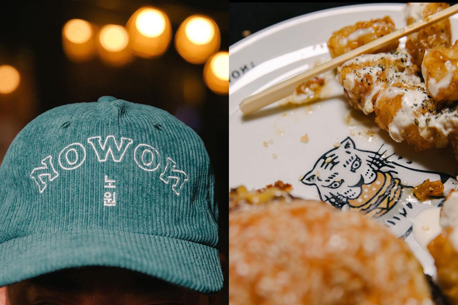
In addition to our fine and detailed artworks, we have developed a delightful set of lightweight cartoon tiger characters to infuse a sense of fun and playfulness. These characters are featured across various elements such as menus, drinking games, to-go bags, plates, merchandise, and more, becoming a significant part of our brand's identity.


Over the years, we have developed a set of assets that can continue to be utilized as Nowon expands.


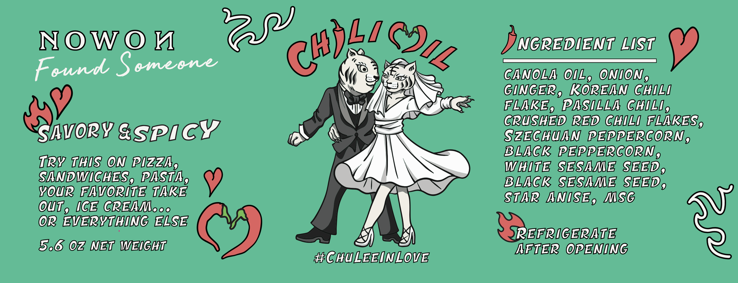
Designing chili oil labels is always a fun challenge. It's rewarding to showcase a brand or restaurant's identity within the constraints of limited space while ensuring all necessary information is communicated effectively. I also had the opportunity to create a fun spin on the original label for Jae's wedding.