
Client: 886
Year: 2018 - Present
Art Direction & Design: Meijun Li (Overice)
Illustrations: Meijun Li, Jane Zhang


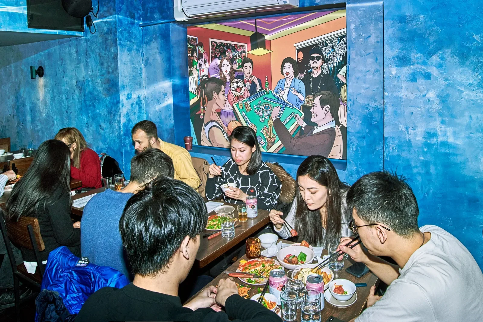
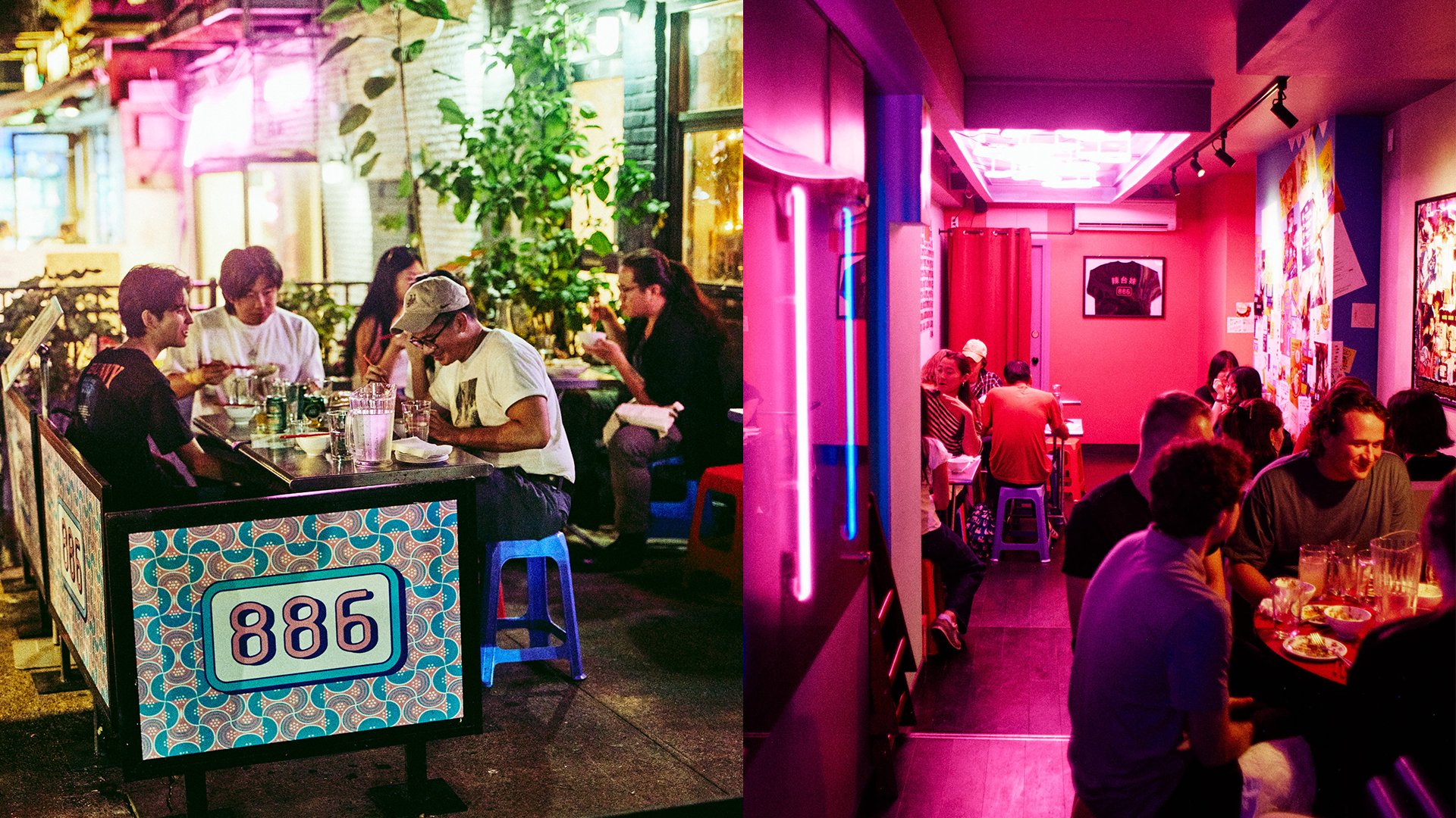
Nestled within the eclectic tapestry of New York City's East Village, Saint Market Street, EightEightSix emerges as a vibrant ode to Taiwanese cuisine. Here, tradition dances with innovation, and authenticity intertwines with modern flair beneath a canopy of dazzling neon lights.
Working with 886 since its inception, I’ve had the unique opportunity to create a brand from scratch—building it, experimenting with different styles, and continuously exploring its evolving identity. This journey has allowed me to shape and redefine the brand’s visual language, embracing bold ideas and pushing creative boundaries along the way.


Drawing inspiration from Taiwan's lively night markets and spirited drinking culture, the visionary minds behind EightEightSix envisioned a space where every corner pulsates with energy and excitement. Thus, the restaurant's identity is etched in vibrant hues and playful neon accents, a homage to the charm of Taiwanese streets at dusk.


Step inside EightEightSix, and you're transported to a world where every dish is a burst of flavor, and every corner is bathed in the warm glow of colorful neon. From the sizzle of the woks to the laughter of patrons, the restaurant embodies a celebration of life, love, and the joy of shared culinary experiences.

Taiwanese Wave Concert Booth Designs
Building on the characters we designed for the anniversary, we introduced these adorable new characters to highlight our food items.


886 4th Anniversary Collaterals
Events collaterals designed around the key branding are always fun characters blending Taiwanese and New York together.

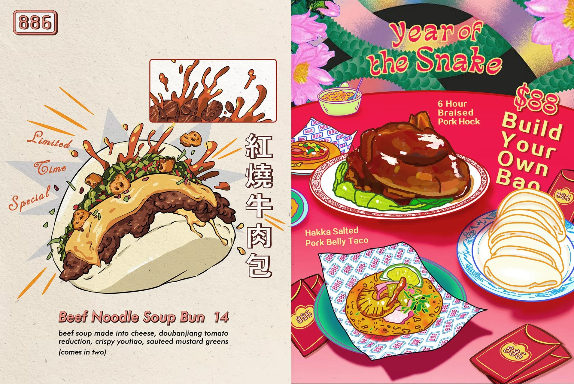
Special Menu Designs
A more realistic illustration style often enhances sales by creating a stronger visual connection with the food, making it look even more enticing and appealing to customers.

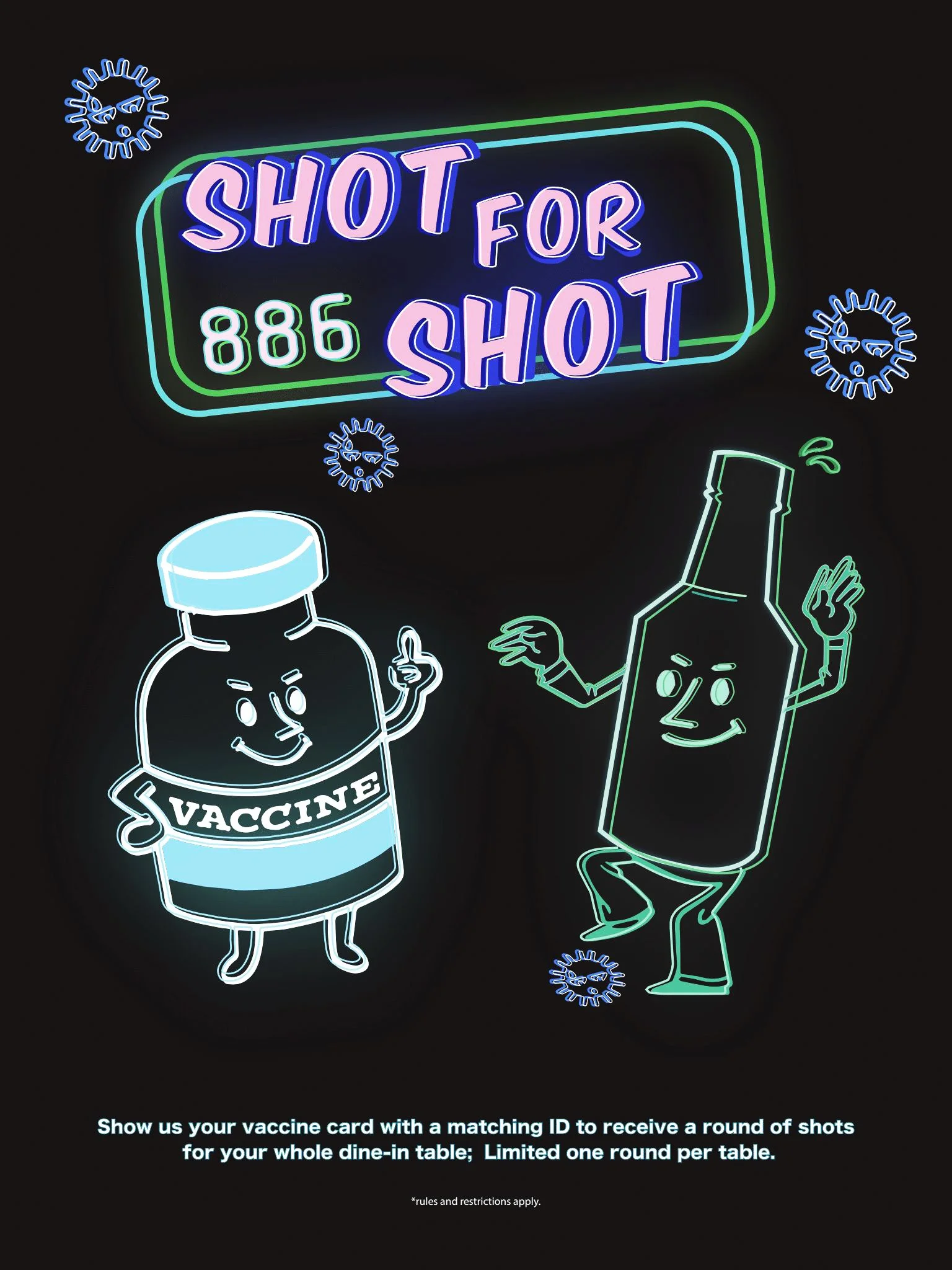
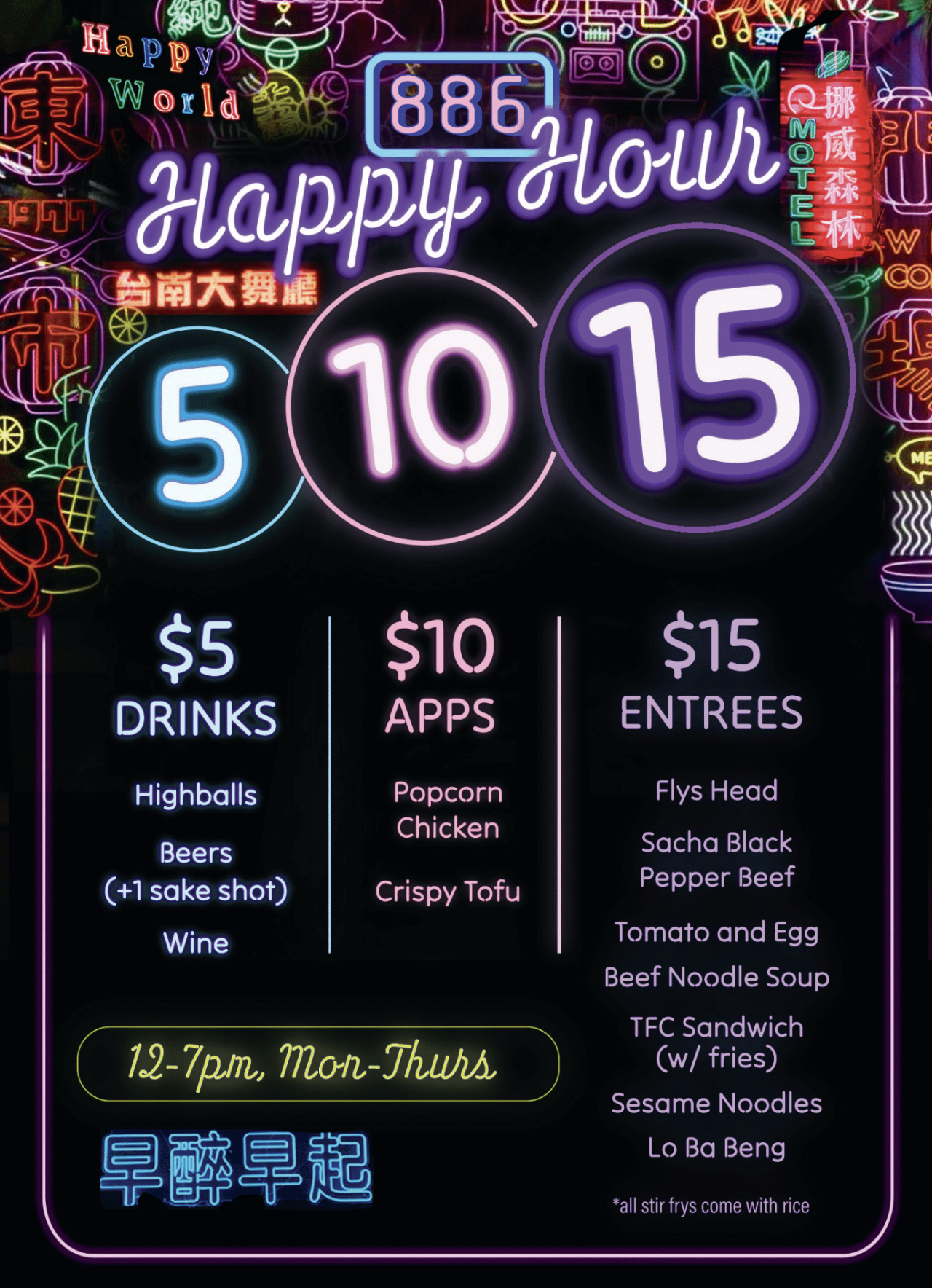
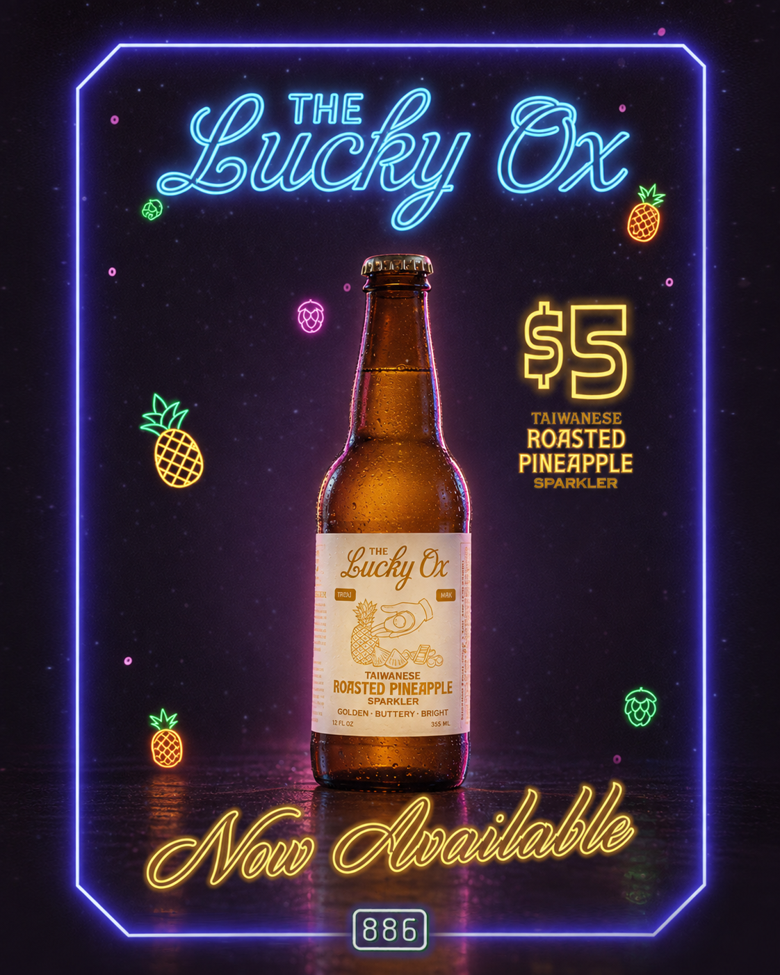
I created promotional Social Media Flyers inspired by the vibrant energy of Taiwanese night markets. Using bold typography, neon colors, playful illustrations, and glowing visual elements, the designs aim to capture the fun and lively atmosphere of the space while keeping each promotion clear, engaging, and memorable.
🍋 THE WORLD OF YIDALI ↓

YIDALI is a dynamic pop-up concept by 886 that brings together the rich flavors of Italian and Taiwanese cultures. With its debut at 886 in New York, the concept was later brought back to Taiwan, extending its vibrant experience across borders. The visual identity is a bold, colorful fusion of neon aesthetics, playfully mixing cheesy Italian charm when envisioning a Taiwanese stir-fry shop set against the backdrop of a small Italian coastal town.


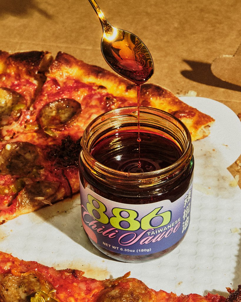
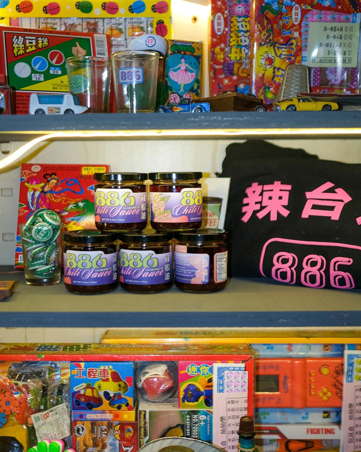
A fresh label design for 886’s signature Taiwanese Chili Sauce, bringing the restaurant’s playful, nostalgic identity into a retail-ready package. Inspired by the bold colors and graphic energy of Taiwanese packaging, the design pairs vibrant typography and retro details with 886’s distinctive visual language.
Before finalizing the label, several design directions were tested over the counter at local shops, allowing us to see how the packaging performed alongside real products in a busy retail environment. The final design was refined to feel distinctly 886 while standing out naturally on the shelf.
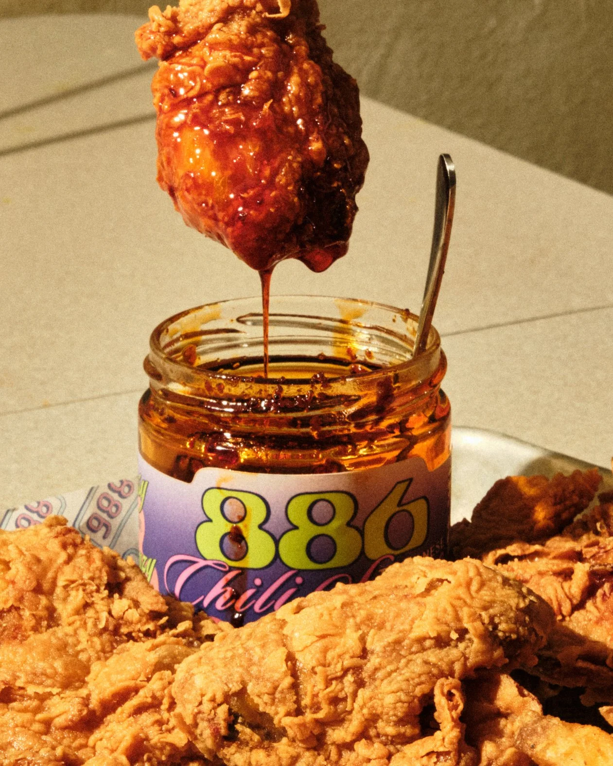
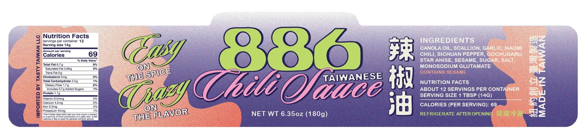
Photo Credits: @Stuffbeneats, Adam Friedlander, Zachary Zavislak, Alex Lau, An Rong Xu, Ethan-Covey, Meijun Li